Using content design to clarify complex product differences
Product differentiation was a recurring UX challenge across the adidas product catalogue. Visually similar products often served very different users and purposes.
I worked on several content design initiatives to clarify these differences and help users make a confident purchase decision. This case study highlights two examples where content design helped make complex product choices easier to understand.
The challenge
During the launch of the World Cup 26 product campaign, we found that many products were visually very similar but varied greatly in their purpose, price points, materials, and intended use.
This created issues for users trying to choose the right product for them. This was especially important for our two main audiences for football products, the performance user and the proxy buyer. One wanted clear, technological explanations while the other needed basic usage explanations.
Without clear, easy to understand differentiation, users would not be able to understand differences in price or purpose. This would likely result in frustrations for the users, along with high product returns.
My role
I led content design work to make product differences clear, concise, and scannable across the experience.
- Researched user language and mental models
- Created concise product descriptions that communicated purpose and usage
- Designed comparison-friendly microcopy for carousel components
- Collaborated with product experts to ensure technical accuracy
- Aligned with marketing and other internal stakeholders to ensure language was consistent in other areas of the experience
- Worked with the localization team to ensure terminology translated clearly across markets
The process
Understanding product complexity
The starting point for every product differentiation project was to gather and understand as much as possible about the products, in this case footballs and football jerseys. To do this I:
- analyzed and mapped out all internal product documentation
- used football blogs, magazines, and other sources to understand users language
- benchmarked competitor language
- reached out to internal experts on the products
- reviewed all UX research reports and documentation on football users
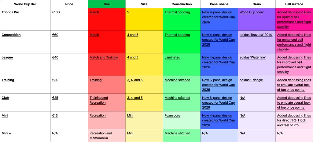
I then organized all this information into a table format where I could easily compare and contrast the products.
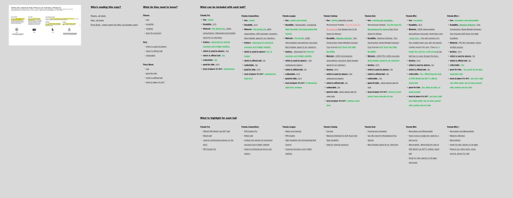
Designing concise and easily scannable product descriptions
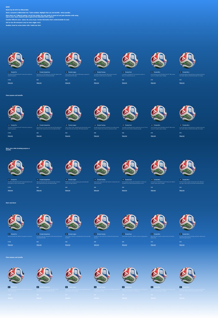
For the World Cup 26 football launch, seven footballs were displayed on a carousel. Overall, the imagery looked extremely similar, despite some subtle differences in the balls. To users who were unsure, they were simply seeing seven of the same balls with very different price points.
I created short descriptions where the user could compare the balls side by side and understand it’s use. The focus was on the product purpose, the performance level, and its intended use. This helped both performance users and proxy buyers make a confident purchase decision.
I worked with both internal and external teams to ensure the language we used on the carousel aligned with language used elsewhere on the campaign.
Video description
Example of final world cup football carousel with this title and description: FIFA world cup 2026™
official match balls. Match, train, or play. Find your winning ball and get a piece of history.
The user then moves through the carousel and can view the following differentiation copy for each ball:
Number 1: Trionda Pro. The official FIFA World Cup 26™ match ball. Used by the world’s top players. €150
Number 2: Trionda Competition. Built for match play with enhanced precision and stable flight. FIFA Quality Pro certified. €60
Number 3: Trionda League. Train, play, or both. Designed for outstanding ball control. FIFA Quality approved. €40
Number 4: Trionda Training. Level up your training with this durable, machine stitched ball. Made for nonstop sessions. €30
Number 5: Trionda Club. A versatile, everyday ball. For the park, the street, or beach, it’s ready when you are. €25
Number 6: Trionda Mini. A mini piece of FIFA World Cup 26™ history. No inflation needed, ready to play or display. €15
Number 7: Trionda Mini +. Build your skills at any age. A mini ball with durable, machine stitched construction. €15
Differentiating similar football jerseys through UI copy
In this case, two football jersey looked almost identical but had quite a different purpose and significantly different price points.
Strict rules around terminology meant it was not possible mentioning technology or materials used. This made defining the copy we would use quite challenging, as we found through research that users wanted to know more about these differences.
Working closely with product experts, I developed the copy for a UI toggle to explain the purpose of the jersey and who the intended user was. Through this copy, it became clearer why there was a difference in price point.
For proxy buyers, who may have very little knowledge on football jerseys, we pointed out who it was for. This made it clear for them what jersey they needed for the person they were buying for.
For performance users, the copy helped them understand the purpose and they could move further into the journey to find technical information they may have needed.
For football fans, they could choose between the jersey their favourite players wore or one made for fans. Their final decision came down to price point.
Video description
The user moves through a webpage with lots of different football jerseys. They pick one and move to that specific jersey’s detail page. There, they find the jersey toggle with the following differentiation copy: Jersey Type. Home. Worn with pride on match day or everyday. Home Authentic. Elite performance jersey. Worn by the top players on the pitch.
Ensuring global scalability
Both the jersey toggle and the football carousel copy needed to be localized to global markets.
I collaborated with the localization team by giving clear context on the terminology used and ensuring they could confidently localize the content for their region.
This meant working with the designers to create strict character limits in English to ensure the linguists has enough space to localize without losing meaning.
Video descriptions
Three videos showing the world cup football carousel project localized to different languages; Spanish, Japanese, and Polish.
The impact
Following implementation of the toggle:
- +2.5% increase in validated quality visits
- -4% decrease in validated product returns
Clearer product differentiation helped users make more confident purchase decisions and reduced confusion between similar products.
Post launch, the football carousel was tested with users and found to significantly help with differentiation. Users commented that without copy, it would have been impossible to understand the differences between balls.
