Project as part of postgraduate in UX Writing and Content Design with SHIFTA by Elisava
As part of my coursework I needed to find a text online that was difficult to understand and make it clearer. I knew where to find it – the social welfare website. It feels as if it’s made intentionally difficult to understand so people abandon the process. This was around Christmas time and I found the perfect riddle to untangle.
Problem:
The text is unclear and the message is confusing. The user will find it difficult to understand.
Solution:
Change text to make it more clear, concise, useful and human.
Process:
Part Time Social Welfare is a payment offered by the Government of Ireland to people who are working part time and not making a minimum monthly wage. These people are usually in difficult situations, often on or below the poverty line. There are also many people with intellectual or physical disabilities receiving the payment.
The information given needs to be clear and concise in order for the people receiving the payment to understand what they need to do.
Before
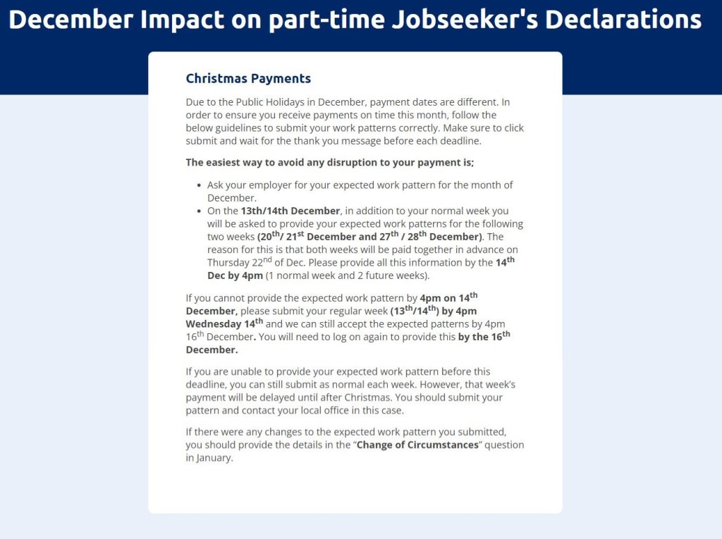
The information provided in this text is neither clear nor concise.
The heading says “December Impact”. The use of impact here is confusing and may be difficult to access. From the begining the user is confused.
There is an overuse of bold. Too many dates are in bold, making it difficult to understand which are important or not.
Bullet points are used to show important information, but then stopped. In the paragraphs that follow, there is also important information. There needs to be more consistency in the use of bullet points.
There are too many words.
The language used is not very accessible. The text does not take into account that users are likely to have accessibility issues.
It has been shown that when we are in a state of financial difficulty or poverty, our decision making skills decrease. We also find it more difficult to problem solve, as the mental load of poverty takes over.
After
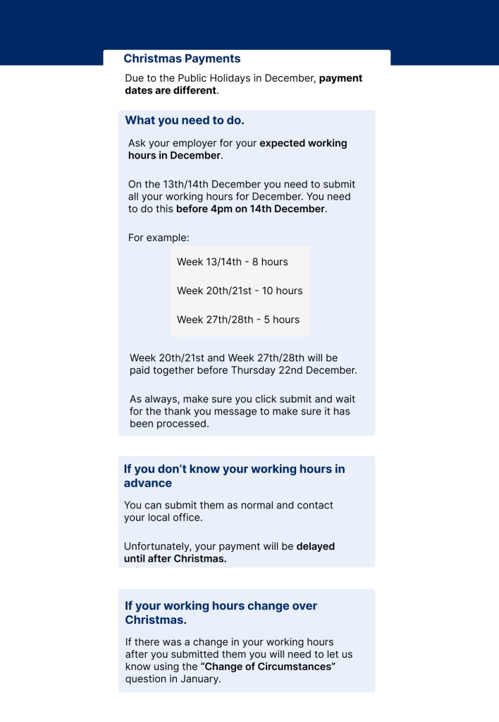
Changed the word “impact” to “changes” to make it clearer.
Made the first paragraph into one sentence highlighting the important information.
Divided the information given into sections, in order to make it clearer. Each section starts with a statement that the user could apply to their situation. The information is in its own box, to make each part stand out more.
Important information and deadlines are in bold.
Information is broken down to make it clearer. An example and an image show what needs to be presented before the deadline. A copy of the actual form used would have been helpful as an example.
Some information from the first paragraph was moved to this section, where it was more appropriate.
The language is more concise and clear.
There were too many words in the original piece.
The tone is serious, as the information is coming from the government, but the language is more simple and accessible.
What I learned:
For this exercise I really needed to break down the information bit by bit to understand the meaning. Nothing was clear and the more I read it, the more confusing it got!
I learned that investigation is just as important as writing. If I couldn’t understand who would be reading the text, how could I make it clearer? I imagined different scenarios and cases and came up with a solution. Empathy was key to carrying out this project.
