Project as part of postgraduate in UX Writing and Content Design with SHIFTA by Elisava
In this exercise I needed to create error messages for two different situations – no internet connection and username already exsists. I had to try convey these messages in few words but ensure that the user woud understand the issue and be able to resolve it without thinking.
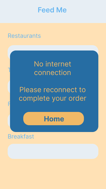
1. Design an error message for no internet connection.
The user is trying to order food using the Feed Me food delivery app.
Problem:
Their internet connection isn’t working and the user cannot continue with their order.
Solution:
An error message stating the problem and how to resolve it so the user can continue ordering food.
Process:
“No internet connection” – straight to the point and clearly explains to the user what the problem is.
“Please” – polite, the user is probably frustrated and may be annoyed if the tone isn’t polite.
“Please reconnect to complete your order” – explains to the user what the next step is.
“Home” CTA button – the user can leave the error message screen knows they will go to the home page.
Colours – the screen the user is currently on fades to the background and the error message pops out in stronger colours. This helps the user pay atttention to the message, while using the same colour scheme as the brand.
2. Design an error message when the username already exists.
The user is trying to create an account with the Keep Fit app.
Problem:
The username choosen already exists on the Keep Fit app.
Solution:
An error message explaining that the username already exists and letting the user know they need to choose another
Process:
“Sorry” – apologethic, as the user may be frustrated that they cannot pick their usual username
“this username already exists” – direct and informative, explains to the user what the problem is
“Please try another” – lets the user know the next step
Extra bold username – bring the users attention to the username they have choosen, they can see that there is a problem with it
Strong colour and bold font for error message – using a stronger colour and bold font for the error message makes it stand out and will stop the user from trying to continue to the next field

What I learned:
There was a lot of thinking and research behind these messages. I used Jane Ruffino´s Microcopy Canvas to help get a clear idea of the user and the problem they were having.
This helped me understand how to create these error messages in an empathetic way, where I could help the user get back to where they needed to be with minimal stress or effort.
