Project as part of postgraduate in UX Writing and Content Design with SHIFTA by Elisava
In this exercise I needed to create three transactional emails for different situations. I had to focus on the information architecture and ensure that the user could find all the information they needed easily and without any problems.
Problem:
Email to a student reminding them that the deadline for their assignment is approaching.
Solution:
Process:
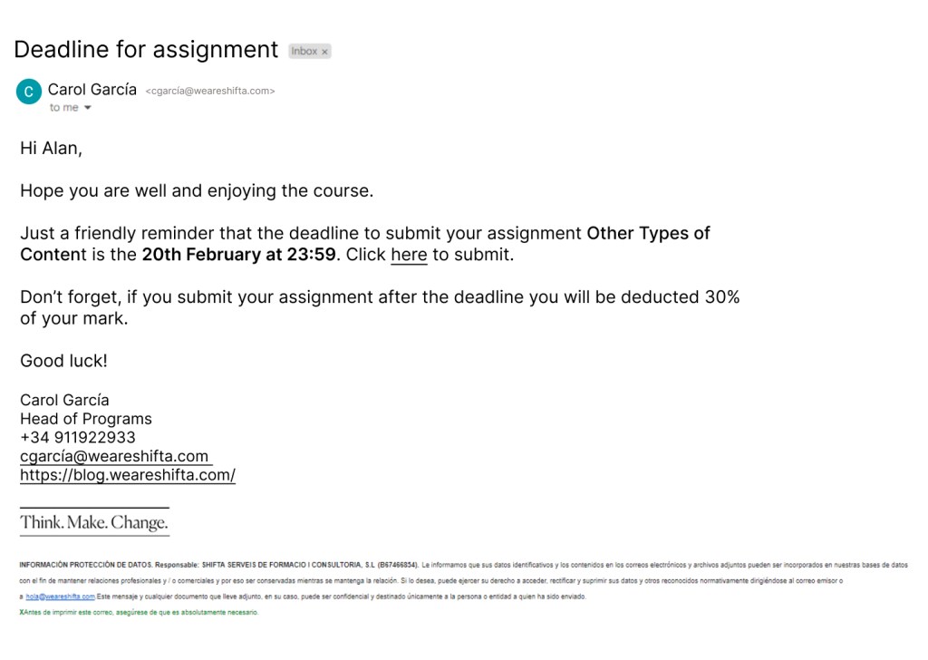
Subject – Deadline for assignment – lets the user know what the email contains before they
even open it.
Hi Alan – Hi instead of Dear creates a relaxed atmosphere. Using the users name can make it seem more personal that saying Hi Shifter or simply Hi.
Introduction asking how the user is and about the course giving a friendly tone to the email.
Main text includes essential information. Opening the sentence with Just a friendly reminder implies that the user probably already knows the deadline date and this email is just in case. The name of the assignment and the deadline are in bold so the user is drawn to the important information. There is also a link to the submission page.
Reminder that they user will be deducted 30% if they submit their assignment after the deadline to ensure the user is aware of this. The sentence opens with Don’t forget creating a friendly opener to a sentence that could cause stress.
Good luck! closes the email as it started, on a friendly and supportive note.
The email signature gives information of different ways to contact the school if the user needs to.
Problem:
Email to interview candidate letting them know they’ve reached the penultimate stage of the process and need to complete a task to show their knowledge.
Solution:
Process:
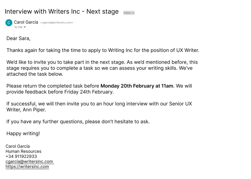
Subject – Interview with Writers Inc – Next stage – lets the user know that they have passed to the next stage without even opening the email. This will ensure they pay more attention to the content.
Dear Sara – creates a professional start to the email. Using Hi or Hello may seem a little too friendly or informal. Essential to use the users name to make them feel welcome.
Introduction lets the user know that the company appreciates them taking the time to interview. This is a professional yet friendly way of telling the user they value their time.
First paragraph clearly explains to the user that they need to complete a task and tells them where they can find the task. Uses contractions – We’d, We’ve – to give a friendly tone to this section. Using We instead of the passive you are invited helps the user feel part of the group and supported.
Second paragraph the deadline date is highlighted to attract the users attention and let them know this information is important. A feedback date is also provided, letting the user feel relaxed knowing how long they have to wait.
Third paragraph explains the next step in the interview process. This lets the user know exactly what to expect.
The main body is divided into paragraphs to ease the users cognitive load. Dividing the information makes it easier to process.
Ends with a supportive sentences to let the user know they can ask questions if they need.
Closes with Happy Writing! leaving the user on a friendly note.
Problem:
Email to a customer telling them that there package has been lost and they won’t be able to collect it.
Solution:
Process:
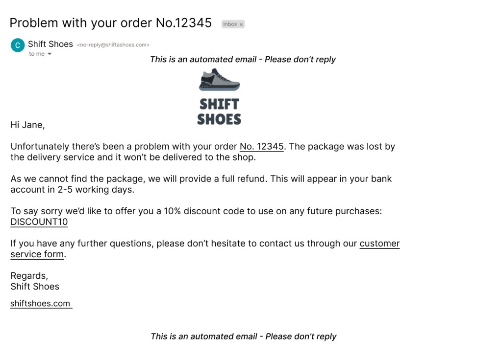
Subject – Problem with your order No.12345 – Grabs the users attention and makes them aware that the information in the email is important.
Brand logo displayed as a header.
Uses Hi Jane to personalise the email. The user is receiving negative information and personalising the greeting can calm their annoyance.
Introduction gets straight to the point and explains the problem. Link in order number so the user can see which order it is.
Second paragraph explains the solution. Lets the user know how long their refund will take. Uses we throughout to show that the company takes responsibility. Using the passive here could cause annoyance and increase the users cognitive load.
Third paragraph opens with an apology and offers a discount to the customer, letting them feel seen and helping calm their frustrations. The discount code is in capital letters so it stands out. It is also linked to the shop so the user can use it straight away.
Closing paragraph lets the customer know they can ask questions through a form, which is linked. This shows them the company is welcome to questions or feedback.
Signs off with Regards to end on a more formal note. Ending with Bye, Peace out, See ya would seem a little too informal in this situation and may annoy the user.
Email opens and closes letting the user know it is an automated email and they cannot reply.
What I learned:
Here I learned a lot about information architecture. I needed to ensure that the information was presented in a way that was easily accessible to the user and ensured they understood everything.
To research, I analysed different emails I’d received to understand why the information was presented this way.
