Project as part of postgraduate in UX Writing and Content Design with SHIFTA by Elisava
In this exercise I had to choose some 404 pages from different types of companies and change them, explaining the reasoning behind my decisions. I examined in detail their different styles of voice and tone to ensure my changes connected with the brand.
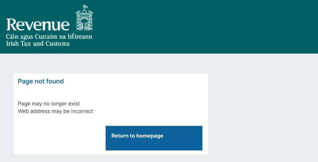
1. Irish Revenue Office
Site:
Tax and Revenue website used by Irish businesses and residents to process tax returns
and find information.
Users:
Every individual and business who pays tax in Ireland
Issues:
Technical language
Language not in keeping with voice (should be informative and clear)
No call to action
No access to another page on the website
Change in design and colour
Accessibility issues
Changes:
Clear language
Call to action
Design and colour consistent with rest of website
Voice more appropriate
Reasoning:
Revenue.ie is a government website where users are quite varied. They need to be informed and understand step by step what actions they need to take.
The voice of this website is informative, respectful and clear but the 404 page is not.
When the user arrives at the 404 page they are likely to feel frustrated, annoyed or even lost. The tone needed is serious and respectful, while using clear language to ensure the user understands.
The updated 404 page uses clear language, is informative and indicates what the users next step needs to be. It also informs them of possible errors that have occurred, but doesn’t overwhelm them with information.
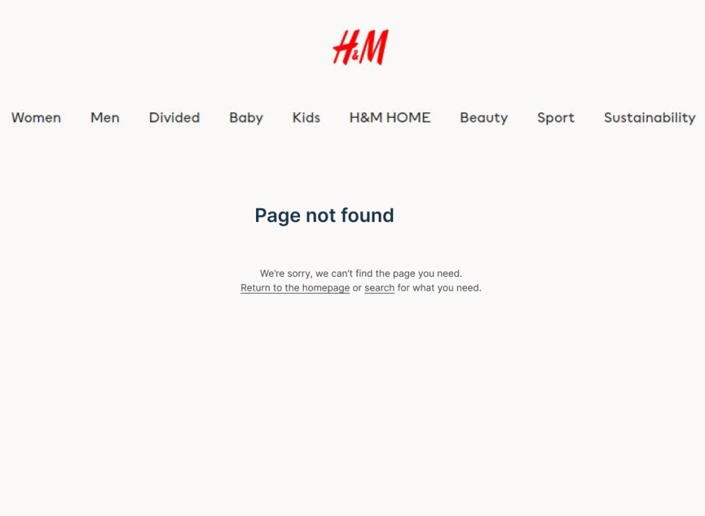
2. H&M
Site:
H&M – a Swedish clothes brand
Users:
Fashion brand aimed at both low and high income customers
Issues:
Dead end page
No visible call to action
No visible link to another page on the website
Use of capitals not fitting with the voice – aggressive, intense

Changes:
Call to action
Menu in banner – consistent with rest of site
Changed header from capital letters – consistent with rest of site
Reasoning:
H&M are a Swedish fashion brand who sell to many different users, low and high income, young and old.
In their brand values they describe themselves as being straightforward, honest and inclusive.
Their brand voice is friendly, straightforward and clear. The tone used is slightly apologetic and clear.
In their 404 page it was necessary to ensure that the message matched with their voice. In the original, the use of capitals could have come across as intense or aggressive, as they don’t use all capitals in other areas of their website.
There was no visible call to action, which means the user may be confused as to how to leave the 404 page. Introducing a menu above the message made sure users can find a way to leave.
As they say “Page not found”, I chose to continue this in the explanation below, instead of changing the message. Saying “we’re sorry, we can’t” is apologetic and also letting the user know that it may not be their fault the page isn’t working.
Below the explanation, including links to the homepage or search helps the user continue where they need to go on the site.
Repeating “you need” in the explanation and solution helps the user feel comfortable that they will find a solution. This creates a reassuring tone.
The use of a call to action button was not necessary, as a link in the text is straightforward enough.
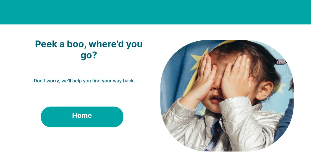
3. Pampers
Site:
Pampers is a nappy and baby wipe company
Users:
Parents of babies and toddlers
Issues:
No indication of where to go next
Technical language – “Error code: 404”
Mention of app underneath may cause confusion

Changes:
More playful language
Call to action – home page
No other distractions on page
Reasoning:
Pampers is a nappy and baby wipe brand whose voice is a caregiver. They help their users feel at ease and that they can trust them.
In their 404 page, they use a clear tone to explain that something isn’t right, but they don’t help the user resolve their problem. This may leave the user feeling confused and frustrated.
They also use the technical “Error code – 404” which doesn’t fit with their voice.
Beneath this, where the user is expecting a call to action to leave the page, they try to sell their app. This may leave the user feeling annoyed or tricked, as they are looking for a way to leave the page.
By making the tone clear, but a little playful, the user will feel comfortable and understand what their next step needs to be.
Pampers use the image of a child looking excited. While it may be cute to use this picture, it doesn’t connect with the page or text. Nobody is excited to be on a 404 page.
In changing the image to a baby/toddler playing peek-a-boo and connecting it with the text, it maintains the cute, playful image of the child but is more connected with the tone.
The text used is “Don’t worry, we’ll help you” to ensure that Pampers caregiving voice is clear, but the tone, guiding, helps ease the customers’ annoyance or anxiety and they can see a clear path off the page.
Included is a call to action button clearly marked “Home” so the user can easily see where to go.
What I learned:
I needed to do a lot of analysis of the different brands to complete this exercise. I researched using their websites and looked at their voice and tone using Jung’s archetypes.
Nobody is happy to see a 404 page so I learned how to use the brands voice and tone together to make sure the user understands what is happening and can get back to where they need to go.
I researched different style guides, such as gov.uk, Mailchimp and Shopify, to find out how to present the information correctly.
